
Engineering Leadership Reporting Automation: A Step-by-Step Guide for Dev Teams
Engineering Leadership Reporting Automation replaces the manual, hours-long process of piecing together data from GitHub, Linear, and Slack with pre-computed signals that surface risk, stalls, and momentum in real time. This step-by-step guide walks startup dev teams and engineering managers through building an automated reporting stack that informs decisions instead of just describing the past.
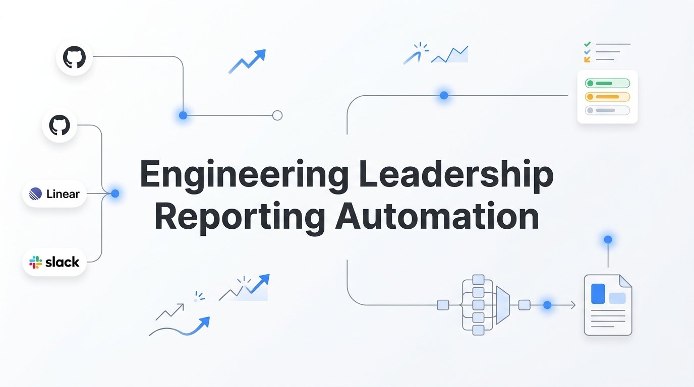
Manual engineering reporting is a quiet tax on technical leadership. Every week, engineering managers and CTOs piece together updates from GitHub, Linear, Slack, and spreadsheets, spending hours synthesizing data that's already stale by the time it reaches stakeholders.
The result: reports that describe the past instead of informing the future, and leaders who are too buried in data collection to actually lead. This isn't a personal failing. It's a structural problem baked into how most dev teams approach reporting.
Automating engineering leadership reporting changes this equation. Instead of chasing metrics, you get pre-computed signals delivered in context: what's stalled, what's at risk, where momentum is building or fading. The difference between a metric and a signal is the interpretive layer. Raw data tells you PRs merged this week. A signal tells you whether deployment risk is elevated based on merge volume and code churn. That distinction is everything.
This guide walks startup dev teams and engineering managers through a practical, step-by-step process for automating their reporting stack: from auditing what you're currently tracking, to connecting your existing tools, to generating executive-ready summaries without writing a single line of SQL.
Whether you're a CTO preparing board updates, an engineering manager running weekly standups, or a founder trying to understand what your dev team is actually shipping, this guide gives you a repeatable system. By the end, you'll have an automated reporting pipeline that surfaces the signals that matter: team health, deployment risk, initiative progress, and momentum, without manual effort.
Let's get started.
Step 1: Audit What You're Currently Reporting (and What's Missing)
Before you automate anything, you need to know what you're actually producing. This sounds obvious, but most teams are surprised by what they find when they sit down and list every report they generate.
Start by cataloging everything: sprint summaries, velocity charts, incident postmortems, stakeholder updates, board decks, and any ad-hoc Slack updates that have quietly become recurring obligations. Write them all down.
Next, apply a simple filter to each one. Ask three questions: Who consumes this report? How often? And what decision does it inform? If you can't answer the third question clearly, that report is a candidate for elimination, not automation. Automating a report that doesn't drive decisions just produces noise faster.
Now look for the gaps. Most engineering teams track output metrics: PRs merged, tickets closed, story points completed. These are easy to measure and easy to visualize. But they're often the wrong things to track. What most teams are missing are outcome signals: Is deployment risk elevated right now? Is team momentum accelerating or slowing? Are there morale indicators that suggest burnout before it shows up in attrition?
This is the vanity metric problem in action. Total commits and lines of code look impressive in a chart, but they don't tell a CTO whether the next release is risky or whether a key engineer is quietly disengaging. Decision-ready signals do.
To make this concrete, sort your current metrics into two columns. One column for vanity metrics: things that describe activity but don't prompt action. One column for decision-ready signals: things that tell you something is wrong, improving, or needs attention. The second column is what you'll automate. The first column is what you'll reconsider.
Common pitfall to avoid: Automating broken reporting just produces bad reports faster. Fix the signal before you automate the delivery. If your current sprint summaries don't help anyone make a decision, redesigning them is step one, not step two.
Success indicator: You have a clear list of five to eight metrics that directly inform engineering decisions, with identified owners, consumers, and cadences attached to each one. This list becomes the foundation for everything that follows.
Step 2: Connect Your Existing Dev Tools as Data Sources
The good news about engineering leadership reporting is that most of the data you need already exists. It's sitting in GitHub, Linear, Jira, and your deployment pipeline. The challenge isn't generating data. It's connecting it and making sense of it in one place.
Start by identifying your core data sources. For most startup dev teams, this means three categories: a code repository like GitHub or GitLab for code activity, a project management tool like Linear or Jira for work tracking, and whatever you use for deployment tracking and release management.
When it comes to integration approach, you have options. Native connectors are the fastest path: platforms built to ingest these tools directly can be up and running in minutes. API-based integrations offer more flexibility but require engineering time to build and maintain. AI-native platforms that ingest multiple sources simultaneously are increasingly the right choice for teams that want interpretation, not just aggregation.
Here's what to pull from each source. From GitHub, the most valuable data points are PR merge rates, code churn, review cycle times, stalled pull requests, and branch activity. These are the raw ingredients for deployment risk assessment. A sudden spike in merge volume combined with high code churn is a signal worth flagging before a release, not after.
From Linear or Jira, focus on initiative progress, ticket aging, work-stream velocity, and blocked items. These tell you whether key projects are on track and where work is quietly piling up without resolution.
A word of caution here: avoid the "more data is better" trap. It's tempting to connect every tool your team touches, but that leads to dashboard overload rather than clarity. Connect sources that map directly to the decision-ready signals you identified in Step 1. If a data source doesn't feed a signal on your list, leave it out for now.
Privacy and access consideration: When connecting any dev tool to an analytics platform, use read-only API tokens. Understand what data leaves your environment and how it's handled before you connect anything. This matters both for security and for maintaining team trust. Platforms like Progress are transparent about data handling, and you should expect the same from any tool you evaluate.
Progress, for example, ingests GitHub and Linear natively, which means the connection setup is minimal and the data flow is immediate. No custom pipelines, no ETL work, no engineering hours spent on plumbing.
Success indicator: Your primary code and project management tools are connected and surfacing raw activity data in one place. You can see a unified view of what's happening across your codebase and work-streams without toggling between tabs.
Step 3: Define the Signals That Actually Matter for Your Team
Raw data and operational signals are not the same thing. This is the step where most teams either get it right or fall back into the vanity metric trap. The goal here is translation: turning what your tools collect into intelligence your leadership team can act on.
Think of it this way. "PRs merged this week" is data. "Deployment risk is elevated based on merge volume and code churn" is a signal. The second version tells you something. It prompts a question: should we delay this release? Should we add a review step? That's the difference between a dashboard and a decision tool.
There are four signal categories that every engineering leadership report should cover.
Work health: What's stalled or blocked? This covers tickets that have been sitting without movement, PRs that are aging without review, and initiatives that have gone quiet. Stalled work is often the earliest indicator of a problem, whether it's a technical blocker, a prioritization conflict, or a team capacity issue.
Deployment risk: What's the change pressure on the codebase right now? High merge volume combined with significant code churn creates elevated deployment risk. This signal is particularly valuable in the days leading up to a release.
Initiative progress: Are key projects on track? This is the signal that founders and executives care most about. Not the granular ticket-level detail, but the directional answer: is this initiative healthy, at risk, or off the rails?
Team momentum and morale: Is the team accelerating or slowing? This is the signal most engineering tools ignore entirely. Momentum changes, whether a team that was shipping fast has slowed, or a team under pressure is showing signs of fatigue, are leading indicators that show up before delivery problems do.
Now match these signals to your audiences. Founders and executives need initiative health and risk summaries in plain language. Engineering managers need team momentum data and blocker visibility. CTOs need the full picture, including morale indicators and deployment risk trends.
Set thresholds for alerts vs. status updates. Not every signal needs to trigger a notification. Stalled PRs above a certain age, elevated deployment risk before a release, or a measurable drop in team momentum: these should trigger alerts. Routine progress updates can wait for the scheduled report.
Avoid metric overload. Pick two to three signals per audience and make them actionable, not just informational. A signal that doesn't prompt a specific response isn't doing its job.
Success indicator: You have a defined signal map: which metrics, for which audience, at which cadence, and what action each signal should prompt. This document becomes your reporting architecture.
Step 4: Configure Automated Report Templates by Audience
One report for everyone is a report optimized for no one. The most effective automated reporting systems serve distinct audiences with distinct templates, each calibrated to the decisions that audience needs to make.
Build three core templates to start.
Executive and board summaries should run weekly or bi-weekly and answer three questions in plain language: What shipped? What's at risk? Is the team healthy? No engineering jargon, no ticket IDs, no velocity charts. Executives need directional confidence, not operational detail. If they have to interpret the data to understand it, the report has failed.
Engineering manager reports should run daily or weekly and surface blockers, stalled work, and team momentum changes since the last report period. These are operational reports. They should tell the EM what needs their attention today, not give them a historical summary of what happened last week.
CTO dashboards should be continuous or near-real-time and cover deployment risk signals, code churn trends, initiative health across work-streams, and morale and wellness indicators. The CTO needs to see the full picture across the engineering organization, with enough depth to make calls on release timing, team structure, and resource allocation.
Here's where natural-language generation becomes a meaningful differentiator. Traditional reporting tools give you charts and leave the narrative to you. AI-native platforms can produce narrative summaries directly from raw activity data, eliminating the "translate data into prose" step that typically consumes the most time in manual reporting.
Progress generates executive summaries on demand, pulling from connected data sources and producing plain-language assessments of engineering health without requiring a human to write the first draft. For a CTO preparing a board update or a founder summarizing engineering progress for investors, this is a significant time recovery.
For template structure, a format that works consistently across all audiences is: a one-line status indicator (green, yellow, or red), a three-sentence narrative summary, and a short action list. This structure forces clarity and makes every report immediately scannable.
Template tip: Resist the urge to add more sections because you can. Every additional section in a report is another thing a reader might not read. Start lean and add only when a specific audience asks for something specific.
Success indicator: Each audience has a configured template that auto-populates from connected data sources with no manual data entry required. The first time a report generates itself and lands in the right hands without anyone touching it, you'll know the system is working.
Step 5: Set Up Automated Delivery and Alert Cadences
A report that exists but isn't delivered at the right moment is only marginally better than no report at all. Delivery timing and channel selection are where your reporting system either earns trust or gets ignored.
Schedule report delivery to match decision cycles, not arbitrary calendar slots. Weekly engineering updates should land before Monday planning sessions, not after. Executive summaries should arrive before leadership syncs, giving stakeholders time to read and formulate questions. Deployment risk alerts should be real-time, not batched into a weekly digest.
Choose delivery channels based on how each audience actually consumes information. Slack works well for async team updates and engineering manager digests. Email is more appropriate for executive summaries that need to be referenced, forwarded, or filed. Dashboard links with on-demand access serve anyone who needs to investigate beyond the digest level.
Configure threshold-based alerts as a separate layer from scheduled reports. These are your early warning system. Stalled PRs above a defined age threshold, elevated code churn in the days before a release, or a measurable drop in team momentum: these events shouldn't wait for the weekly report. They should trigger an immediate notification to the right person.
Alert fatigue is a real and well-documented failure mode in automated systems. The instinct when setting up alerts is to flag everything that could matter. Resist this. Start with a small number of high-confidence, high-signal alerts and expand only after validating that each alert actually drives a real response. An alert that gets ignored consistently is worse than no alert: it trains people to dismiss the system.
Build a "digest versus deep-dive" model into your delivery architecture. Automated digests go to everyone on the scheduled cadence. Full data access is available on-demand for anyone who needs to investigate a specific signal. This prevents information overload while keeping the full picture accessible.
Success indicator: Reports are landing in the right inboxes or channels without manual triggering. Alert thresholds have been validated against at least one real incident, confirming that the system surfaces the right signal at the right time.
Step 6: Enable On-Demand Querying for Ad-Hoc Leadership Questions
Scheduled reports answer the questions you knew to ask. Ad-hoc querying answers the ones that surface in the middle of a planning session, a board prep call, or a conversation with an investor who wants to know whether a key initiative is on track.
This is a capability that traditional reporting tools simply don't offer. Charts and dashboards are static. They show you what someone decided to measure when the dashboard was built. But leadership questions are dynamic. "Which initiatives are behind schedule?" "Has team momentum changed since we reorganized?" "What's our deployment risk going into next week's release?" These questions need live answers, not pre-built views.
Modern AI-native platforms increasingly support plain-language querying of engineering data. Instead of navigating dashboards or writing queries, a CTO or engineering manager can ask a question in natural language and get an answer grounded in real activity data.
Progress uses an MCP server and Claude API integration to enable exactly this. It allows AI assistants to query live engineering data, making it possible to answer leadership questions in real time without pulling up dashboards or opening spreadsheets. The underlying data is the same data your connected tools are already generating. The difference is the interface: instead of reading a chart, you ask a question and get an answer.
To get the most out of this capability, identify the five to ten most common ad-hoc questions your leadership team asks during standups, planning sessions, and board prep. Verify that your system can answer them before you rely on it in a high-stakes context. Then train your leadership team on what the system can and can't answer well. This drives adoption and reduces the instinct to revert to manual report-pulling when a question comes up unexpectedly.
The goal is to make answering a novel engineering question a two-minute task, not a two-hour one. When your team reaches that point, the reporting system has genuinely changed how leadership operates.
Success indicator: Your team can answer a question that wasn't in any scheduled report in under two minutes using the automated system, without opening a spreadsheet or asking an engineer to pull data.
Step 7: Review, Refine, and Evolve Your Reporting System
Automated reporting systems don't stay relevant on their own. Teams grow, priorities shift, and the metrics that mattered six months ago may not be the ones that matter today. Building a review cadence into your system is what separates a living asset from a dashboard that slowly becomes irrelevant.
Run a monthly reporting retrospective. The format should feel familiar to engineering teams: it's the same structure as a sprint retrospective, applied to your reporting system. Which automated reports were actually read? Which drove a decision? Which were opened once and ignored? This data is more honest than any survey.
Prune ruthlessly. If a report hasn't driven a decision in thirty days, either fix it or remove it. The instinct is to keep reports around "just in case," but every unnecessary report dilutes attention from the ones that matter. A smaller set of high-signal reports is always more valuable than a comprehensive set of reports no one reads.
Watch for signal drift. As your team scales or your product strategy shifts, the signals that matter change. A startup in early growth phase cares deeply about shipping velocity. A team preparing for a major release cares more about deployment risk and code stability. Update your signal map quarterly to reflect where the team actually is, not where it was when you set the system up.
Incorporate feedback from report consumers, not just producers. Ask stakeholders what questions the reports aren't answering. The engineering manager who reads the weekly digest every Monday knows better than anyone whether it's actually useful. That feedback is the most direct signal you have about whether your reporting system is doing its job.
Finally, measure the meta-metric: how much time is your team spending on manual reporting compared to sixty days ago? This is your clearest indicator of automation ROI. If the number isn't going down, something in the system needs adjustment.
Success indicator: Your reporting system improves measurably each quarter. Reports that aren't working get fixed or removed. New signals get added as the team's needs evolve. The system feels like a tool your team uses, not a process your team maintains.
Putting It All Together: Your Automated Reporting Checklist
Automating engineering leadership reporting isn't a one-time setup. It's a system you build, validate, and refine. The seven steps in this guide give you a repeatable framework for getting there, but the real value compounds over time as the system learns your team's rhythms and your leadership team learns to trust it.
Here's your quick-reference checklist to track where you are in the process.
1. Audited current reports and identified decision-driving signals
2. Connected GitHub, Linear, and core dev tools as data sources
3. Defined signal categories by audience: executive, engineering manager, and CTO
4. Configured automated report templates with narrative summaries
5. Scheduled delivery cadences and threshold-based alerts
6. Enabled on-demand natural-language querying for ad-hoc questions
7. Established a monthly review cycle to prune and improve
The goal isn't more dashboards. It's fewer manual hours and faster decisions. When your reporting system is working well, leadership conversations shift from "let me pull that data" to "here's what the data is telling us." That's a meaningful change in how a technical organization operates.
Platforms like Progress are built specifically for this kind of reporting transformation. It ingests your existing tools, computes pre-built operational signals covering stalled work, deployment risk, team momentum, and morale, and delivers executive-ready summaries without requiring you to become a data analyst. The interpretive layer is built in, which means you get signals, not just metrics.
If you're ready to move beyond manual reporting and build a system that actually informs decisions, learn more about our services and see how Progress turns raw development activity into clear, decision-ready signals for technical leaders.