
Engineering Observability Explained: What It Means for Dev Teams
This article gets engineering observability explained in plain terms, showing how it interprets raw dev data like commits, PRs, and tickets to reveal risk, stalled work, and team burnout. It also breaks down how observability differs from monitoring and dashboards, especially for startup teams without dedicated platform engineering support.
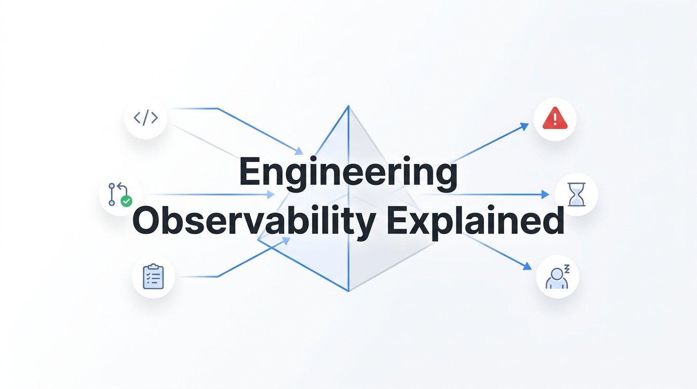
Engineering observability is the practice of turning raw development data, commits, pull requests, tickets, deploys, into clear signals about how a team and codebase are actually doing. It's not a new dashboard or another chart on a wall. It's the layer of interpretation that sits on top of your existing tools and tells you what the data means: where risk is building, what's stalled, and whether your team is speeding up or heading toward burnout. For startup teams without the luxury of a dedicated platform engineering group, understanding this distinction matters more than it might for a 2,000-person enterprise, because you don't have a team of humans to do the interpreting manually.
Observability vs. Monitoring vs. Dashboards
Monitoring answers a narrow question: is the system up or down? It's built around thresholds and alerts, CPU usage crossed 90%, a service returned a 500 error, a deploy failed. Monitoring is essential, but it's binary. It tells you something happened. It doesn't tell you why, or whether it's connected to something else happening three tickets and two pull requests away.
Observability is broader. It connects related signals so you can understand the "why" behind a state change. In infrastructure, that might mean correlating a latency spike with a recent deploy and a specific service's memory usage. In engineering team observability, the equivalent is connecting a spike in code churn with a drop in review turnaround and a cluster of tickets that suddenly went quiet. None of those signals alone tells a full story. Together, they do.
Dashboards sit somewhere in between, and this is where a lot of confusion starts. A dashboard aggregates metrics, commit counts, cycle time, PR counts, and displays them. That's useful for a quick pulse check, but a dashboard doesn't interpret anything. It hands you numbers and leaves you to decide what they mean, which is exactly the work most engineering leaders don't have time to do well on a Tuesday afternoon between three other fires.
This is the root of a common misconception: that more dashboards equal more observability. It doesn't. Ten charts showing commit frequency, PR counts, and ticket velocity can create an illusion of insight while burying the one signal that actually matters, say, a specific initiative quietly losing momentum for two weeks. Volume of data is not the same as clarity. Observability platforms are built to reduce that volume down to a small number of assessments you can actually act on: this initiative is at risk, this deploy carries elevated change-pressure, this engineer's workload pattern has shifted. The value isn't in seeing more. It's in seeing what matters, faster.
What Engineering Observability Actually Measures
A useful way to think about engineering observability is in three layers: code, workflow, and people.
Code-level signals are the most familiar. Merge volume and code churn (how much code is being rewritten or reverted shortly after being written) are strong indicators of deployment risk. High churn combined with a spike in merge volume right before a release is a classic pattern that precedes production incidents. Review latency, how long a PR sits before it gets meaningful feedback, is another: it tells you whether quality checks are keeping pace with output, or whether people are rubber-stamping changes because the queue is too long.
Workflow signals live a layer up, in the tools teams use to organize work rather than write it. Stalled tickets, initiatives that haven't moved in a sprint or two, and work-stream health across systems like Linear and GitHub tell you whether the plan is actually happening or has quietly drifted. A ticket sitting in "In Progress" for three weeks isn't a bug in your project management hygiene, it's often a symptom of a blocked dependency, an unclear spec, or a team member who's stuck and hasn't said so.
The third layer is the one most tooling ignores entirely: human signals. Team momentum, whether work is accelerating or slowing over time, and morale are as predictive of delivery problems as any code metric, but they're much harder to see in a spreadsheet. A team can look productive by commit count while quietly losing steam, and by the time that shows up in missed deadlines, the underlying cause (overload, unclear priorities, a departing team member) has often been building for weeks. This is the layer Progress is built to surface specifically: pre-computed reads on team momentum and morale alongside the code and workflow signals, so a slowdown or a wellness dip isn't discovered after it's already cost you a sprint.
Why Startup Teams Need It Earlier Than They Think
There's a persistent assumption that observability is an enterprise concern, something you adopt once you have a platform team and an SRE on-call rotation. For engineering-team observability specifically, the opposite is closer to true. Large organizations often have staff whose job is to manually stitch together GitHub activity, Linear boards, and standup notes into a coherent picture for leadership. A ten-person startup has none of that. The CTO is doing it themselves, in their head, between writing code and interviewing candidates.
That manual stitching works fine when a team is small and everyone is in the same room. It breaks down fast as a startup scales past a handful of engineers, adds a second product line, or goes partially remote. Change-pressure, the combined risk from merge volume, churn, and the pace of change, accumulates quietly. So does individual burnout. Neither announces itself. A release breaks, or a strong engineer resigns, and only in hindsight does the pattern become obvious: churn had been climbing for a month, review latency had crept up, and one contributor's activity had gone unusually quiet.
Consider a common scenario: a startup is six weeks from a major launch. One initiative, a critical integration, looks fine on the roadmap. Underneath, though, its tickets have been quietly stalling for two weeks, blocked by a dependency nobody escalated. Nobody notices because the team's overall ticket velocity looks normal, other work is moving. It only becomes visible when someone asks for a status update three days before launch and discovers the integration is nowhere close to done. That's not a planning failure so much as a visibility failure, and it's exactly the kind of thing engineering observability is designed to catch early: a work-stream health signal would have flagged the stall the first week it happened, not the week before launch.
Startups don't need observability because they're big. They need it because they're small and fast, with no slack in the system to absorb a surprise.
Common Mistakes When Adopting Observability Tools
The first mistake is treating observability as something you build for leadership reporting. If the only person who ever looks at the tool is the CTO preparing a board update, the tool is functioning as a status report generator, not an operational signal. The real value shows up when engineers and team leads use it day-to-day to catch a stalled ticket or a review bottleneck while it's still small, not when an executive summary is assembled once a month after the fact.
The second is chasing vanity metrics. Commit frequency and lines of code are easy to measure and easy to put on a chart, which is exactly why teams gravitate toward them, and exactly why they're misleading. A high commit count can reflect genuine productivity or a habit of committing in tiny, meaningless increments. Lines of code changed says nothing about whether the change reduced risk or introduced it. These metrics feel like observability because they're quantitative, but they don't tell you about risk, health, or momentum, which are the things that actually predict trouble.
The third mistake is bolting together a pile of disconnected point tools: one for PR analytics, another for sprint velocity, a third for on-call incident tracking, and trying to eyeball the correlations yourself. Each tool might be decent at its narrow job, but none of them talks to the others, so the burden of connecting a churn spike to a stalled initiative to a morale dip falls back on a human, which defeats the purpose. A single system that ingests data across the stack, code, tickets, and deploys, and correlates it, is what actually delivers on the promise of observability. Point tools give you more charts. They don't give you more clarity.
How AI Changes What Observability Can Do
Traditional observability tooling, even good tooling, still leaves a lot of the analytical work to the human looking at the screen. It surfaces the metric; you decide what it means. AI-native platforms change that relationship. Instead of showing you that code churn rose 30% this week, an AI-native platform can pre-compute what that means in context, flagging it as elevated deployment risk tied to a specific service, ahead of a specific release, and surfacing that assessment before anyone has to go looking for it.
This is the core difference between a platform that aggregates and one that interprets. Progress, for instance, is built to ingest data from the tools teams already use, GitHub, Linear, and similar systems, and continuously analyze it to produce ready assessments: which initiatives are stalling, where change-pressure is building, whether team momentum is accelerating or slowing, and what the morale signal looks like right now. That's a fundamentally different starting point than a dashboard that requires you to notice the pattern yourself.
The second shift is in how leaders access that information. Natural-language querying, through something like an MCP server or a Claude API integration, means a technical leader can ask a plain question, "which initiatives are most at risk this sprint," or "has review latency changed on the payments team," and get an answer grounded in actual activity data rather than having to build a query or dig through a dashboard filter. This matters more for startup leaders than it might seem, because most of them are not spending their day analyzing charts. They're in meetings, in customer calls, in hiring loops. An answer that arrives in a sentence, generated on demand as an executive summary, is far more likely to actually get used than a report that requires ten minutes of dashboard archaeology to produce the same insight.
The practical effect is a change in role. Instead of a leader digging through raw activity to find the risk, the platform hands them the interpreted finding and the leader's job becomes deciding what to do about it. That's a meaningful shift in how much cognitive load engineering leadership carries, particularly at a startup where that leader is also, most days, still writing code.
Getting Started: What to Look for in a Tool
If you're evaluating engineering observability tools, a few questions will separate genuinely useful platforms from dashboard products wearing an observability label.
- Does it integrate natively with what you already use? A tool that requires your team to adopt new workflows, tag tickets differently, or change how they use GitHub and Linear will collect incomplete data and create friction that erodes adoption within weeks.
- Does it interpret, or just visualize? Ask specifically whether the platform produces risk flags, health scores, or plain-language assessments, versus handing you raw charts of commit counts and cycle time. If the vendor's demo is mostly charts, that's a dashboard product.
- Does it cover people, not just code? Delivery signals like churn and cycle time matter, but so does whether the tool reads team momentum and morale. A platform that only measures code activity is missing the layer most likely to predict a slowdown before it hits a sprint report.
- Can you ask it questions in plain language? The ability to query activity data conversationally, rather than building custom filters, is a meaningful signal of how AI-native the platform actually is under the hood.
- Does it produce something a non-technical stakeholder can use? An executive summary generated on demand, rather than assembled by hand before a board meeting, is a good test of whether the interpretation layer is real.
Run a short pilot against a real sprint or initiative before committing. If the tool would have flagged a problem you already know happened, in the timeframe it actually happened, that's a much stronger signal than any feature list.
Auditing What Your Current Tools Actually Tell You
Engineering observability is about turning scattered activity data into decision-ready signals, not about accumulating more charts. The practical next step for a startup team is a short audit: pull up whatever tools you're using today and ask, honestly, whether they interpret risk and morale or simply display metrics. If every answer comes back as "we'd have to look at the numbers and figure that out ourselves," you have dashboards, not observability, and the gap between the two is exactly where the next missed deadline or quiet resignation tends to hide.